Capturing Your Attention With Colour
One of the paintings featured this summer.
Colour is one of the most significant pieces of visual information we get from the world around us. As an artist, I use it intentionally, but am also seduced by it, sometimes even disgusted by it, always under it's heady influence. Chances are you too have become calmer at the spa, more talkative and engaged in conversation at the dinner table or inexplicably compelled to look at images on your computer screen, all because of the colours that surround you. The reason why prison cells, waiting rooms and car interiors are not usually painted fire-engine red, while stop signs and traffic lights are, is simple. Red signifies danger and literally "stops" us in our tracks. It causes our pulse to quicken, our hearts to race, blood pressure to rise and increases our appetite. Red assertively asks us to pay attention.
Although there are universal truths about colour, there are also cultural and personal preferences dictated by geography, climate, the economy and even politics. Let me take you back to Election Day, November 8, 2016, In the US. Republicans' and Democrats' colour preferences changed on that day, to become more closely aligned with their own party's colours. It changed from just the day before. On election day, Republicans preferred Republican red and Democrats preferred blue. But days earlier, many Republicans had stated a preference for the blue associated with Democrat's. Colour preferences are far more dynamic and context-dependent than has previously been believed. I am blown away by this. I always thought colour preferences were far more stable.
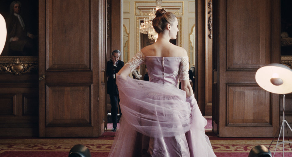
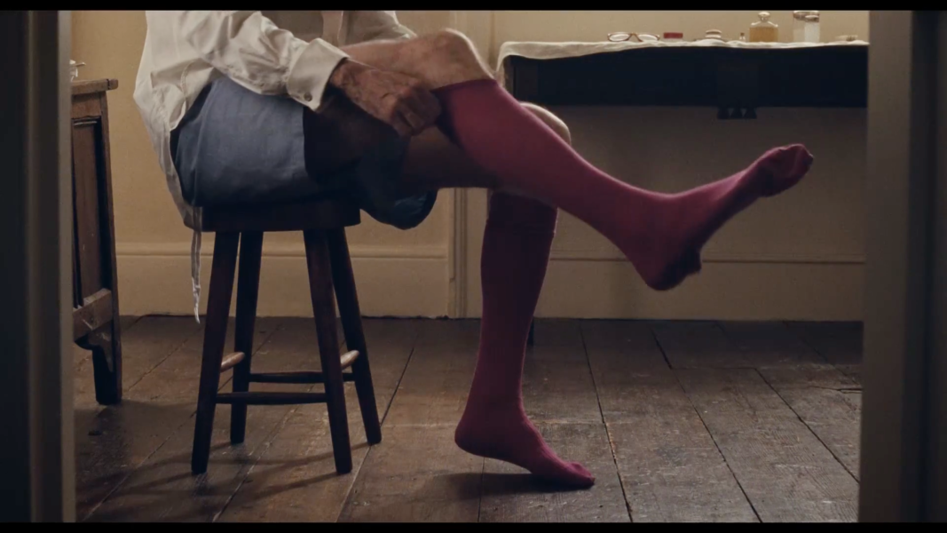
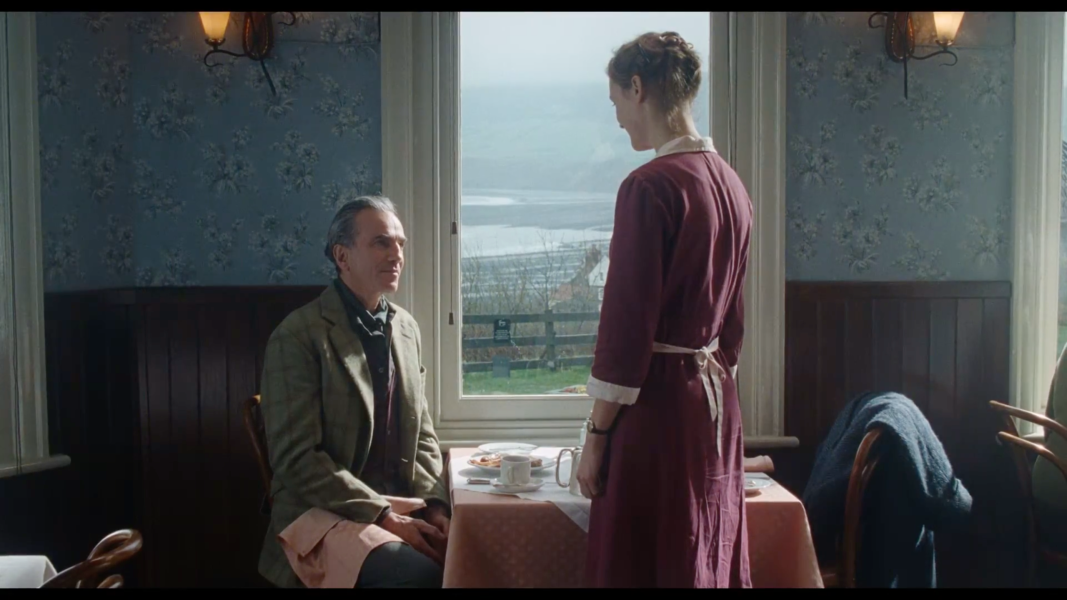
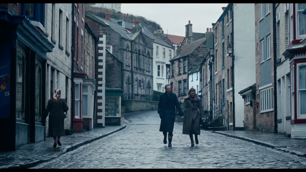
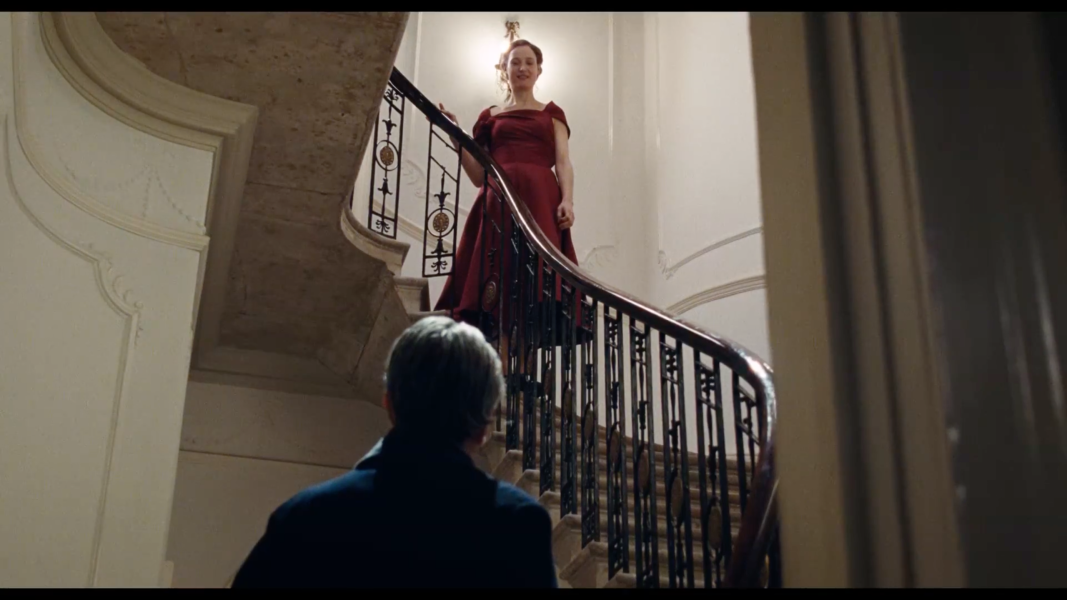
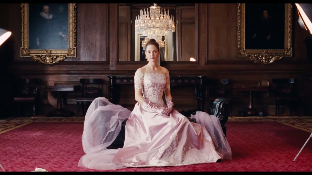
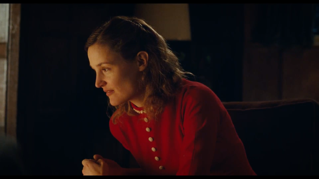
Clearly, not everyone responds in the same way or to the same extent to the colour around them. Personally, I'm easily seduced by the influence of colour. My first job in human resources, I actively spent time negotiating for purple file folders. The standard cream ones left me feeling blah. The job itself, which was not a good fit, might explain the blahness, but I swear those purple file folders made showing up each day slightly tolerable. When I was pregnant with my twin daughters, nothing nauseated me more than a specific shade of a warm sage green. If you aren't picturing it then wait until you have an infectious cough and you'll know that exact shade of green. My main-floor family room was that colour, and upon getting home from work during my first trimester, I'd head straight upstairs to avoid spending even one moment with that green. I'm in love with gold-greens, and blue-greens right now, but sage green and I will never be the same. Bleh! Where colour influences me most, however, and what ultimately clued me into where my life passions lie, was from the movies. My husband loves seeing movies, I often leave them feeling underwhelmed. I am easily transfixed by a movie's colour scheme and where there is none, I lose focus early on. But when colours flow effectively from scene to scene with subtle variation in vibrancy, depth and emphasis they reveal to me, elements of story and character that simply cannot be expressed through dialogue alone. Wanting to understand how this all worked to transfix me, led me to studying colour, design and then art. If you want to experience a film that masterfully uses colour, please see Phantom Thread. It is sumptuous. I added some images below from the film to give you a quick sense of how colour was threaded through every scene and helps unravel the story.
Although you may not find yourself transfixed, motivated or nauseated by colour as I find myself, it is important to realize that obsessed or not, you too are strongly influenced by colour. Advertisers and marketers know this and use colour to influence our shopping decisions. App designers use it to create compelling apps that stimulate the release of dopamine and get us returning time and time again.
And it's working. I spend far more leisure time in 2018 looking at my phone, using apps, playing games, then I could have ever imagined possible back in 1994. (ironically I was working for a cellular phone company at the time) This was almost 25 years ago, which was also when I moved out of the city, into a burgeoning York Region, attracted by the abundance of walking trails, green spaces and kettle lakes generously weaved through treelined residential neighbourhoods. It was an easy decision. Forgoing convenience in favour of easy access to nature which is so fundamental to my wellbeing. There is no question, it makes me calmer, happier and far more resilient to life's stresses. Understandably then, I feel frustrated by the amount of time I spend engaged with technology in my current life.
This all comes back to my current body of work. I paint, albeit abstractly, what I am thinking about, what I love best and want to share with others. Nature and hazy memories of walking down mountains at dusk, getting drenched under waterfalls and the brush of springy moss against the back of my hand all inform my work. The choice to use the vibrant siren-calling colours that capture my attention on-line evolved over time. I'd be Candy Crushing and that thing that happens to me during a movie would happen, and I would lose myself in the colours. Painting whimsical abstracted natural forms with these vibrant rich pop-art colours made the painting process far more joyful and playful. My work became more whimsical and imaginative. It heightened my awareness of all my screen time, and helped draw me into the present moment, allowing me to renew my focus on the beautiful world beyond my screens.
I'm pretty excited about my upcoming solo show at the King Heritage and Cultural Centre this summer. King Township and Art Society King have kindly given me this opportunity to share my large scale vibrant paintings this summer. The very lofty idea in my initial proposal was a reflection on how technology was influencing my work. I was coming at it from a place of equal parts frustration and curiosity. Frustrated with how much time I spent engaged in technology, but curious about where it might lead. I had the unique opportunity to delve into my lifelong love affair with colour. This has led to a positive shift in my work, which is more expressive of my passion for colour, and within me there is less angst over my ever evolving relationship with technology.
Please check out my show at the King Heritage and Cultural Centre, 2920 King Road, King City. July 3 - August 25 10-4 Tuesday to Saturday. Show opening is on July 6th at 7pm. I will be updating my gallery with images from the show after July 3rd.